Have you ever been handed a business card with a grainy logo? Maybe you had a brochure printed and your graphics didn’t look as crisp as you expected.

Chances are your logo was in the wrong format.

There are two main reasons for poor logo quality on printed materials:

  1. Your logo was created in the wrong format (built in the wrong software)
  2. Your logo was created properly, but you used the wrong file for printing

Unfortunately, the first issue is one we run into all the time. This is where the adage “you get what you pay for” rings especially true. There’s more to logo design than owning a computer with a certain piece of software.

There are two terms that will explain the grainy logo problem:

Raster (or bitmap) art:

A raster or bitmap file is an image; it’s composed of tiny pixels of color. If you zoom in, you’ll see all the little squares that create it. In printing, we use the term DPI (Dots Per Inch) to measure resolution. The more dots per inch, the higher the resolution, and the better quality the print. These terms generally come up when you’re printing photographs; you want the image resolution to be at least 300 dpi.

Raster Software: Adobe Photoshop, Affinity Photo, Gimp
Raster File Types: JPG, PNG, GIF, PSD, TIF

If your logo was created in Photoshop, it’s a raster file. Period. It doesn’t matter what file type you save it as. PDF? Nope. It’s still a raster file because it was created in raster software. This means it now has the same printing requirements as your family photos; high-resolution and the proper size (a 300 dpi image that’s only 1″ x 2″ is not going to look good blown up to 5×7).

This is a zoomed in look at a raster/bitmap logo – you can see the pixels and how it would show fuzziness around the edges.

 Vector (or line) art:

Vector art is composed of continuous, mathematical lines and curves. It is not an image or a photo, so it can be scaled to infinite sizes without a loss in resolution. If your logo is vector art, you could blow it up to fit on a billboard and it will look just as good as it does on your flyers, t-shirts, and signage.

Vector Software: Adobe Illustrator, Affinity Designer, Pixelmator, Freehand
Vector File Types: PDF, EPS, AI, SVG

It’s important to note that vector files can be saved as raster files. If your logo was created in Illustrator, but you export it as a JPG, the file has been rasterized and it’s no longer vector art. If it’s a raster file type, it’s a raster file, regardless of how it was originally created.

The logo above recreated as vector artwork. Look closely at the linework around the edges (the irony is this example image is rasterized, since it’s been saved as a JPG for use here. But you should still be able to see the difference).

Logos should always be designed as vector art.

A logo needs to be usable for everything – print, signage, advertising, websites, email newsletters, t-shirts. JPGs and PNGs are standard files for web use, and it’s easy to export a vector logo as those files. Unfortunately the opposite is not true; the only way to export a JPG as vector art is to manually redraw it.

Another reason your logo needs to be designed in vector format is for color separation. These days, the majority of what we print is full color, so full color logos are fine for business cards or stationery. However, if you want to screen print your logo on something (t-shirts), chances are you’ll need to have a 1 or 2 color logo. You can’t really create a true 2 color logo in Photoshop.

Q: How do I know if my logo is vector or raster?

If it’s one of the vector file types (PDF, EPS, AI, SVG), and the lines look crisp, you’re probably ok (though not always – you can open an image in Illustrator and save it as an AI file… but it’s still an image).

If it’s one of the raster file types, then it’s a raster file (JPG, PNG, GIF, PSD, TIF). TIF is high-res format, so that’s a better sign, though still not ideal. If care wasn’t taken to ensure your logo was designed in vector format, chances are it was also not created at 300 dpi. If you print the logo on business cards, it might be ok, since they’re small. But if you need to create a poster, it’s probably not going to look great. Every case is different though – if you aren’t sure, feel free to send us your logo and we can make specific recommendations.

Q: What if my logo is a raster file?

You have two options:

  1. Option 1: Contact whoever originally created your logo, and ask if they have vector artwork. Occasionally the logo has been created in the proper format, but either the original files were never sent to you, or if they were, they got lost or buried in a folder somewhere. Most of the vector formats can’t be viewed without the proper software, so it’s common for business owners to be using the wrong file types, simply because those are the only ones they can actually open. I always send our clients vector logos in PDF format to avoid this issue.
  2. Option 2: If your logo was NOT created in vector software and is too low-res for your project, you’ll need to recreate it in vector format. This is pretty standard in the printing industry (I’ve recreated a massive amount of logos over the years). It happens so often with new clients I just add logo recreation to the estimate if I know we’ll need it. The amount of time required depends on how complex your logo is, but a quick look is all I need to give you a time estimate. The good news is once it’s been rebuilt you won’t have to do it again. At cyclone press, if we’re recreating a logo, we can also redesign it somewhat if it needs a little help (see examples of redesigned logos here).

Q: Why can’t I just save my raster logo at a higher resolution?

This doesn’t really work, and here’s why. If you have a raster file composed of 500 pixels, and you increase the image size, you still only have 500 pixels.

You can increase the dpi at the same time (this is called resampling), but Photoshop has to guess the colors in between the pixels that are already there. You’re not really improving anything, because your logo will actually lose sharpness. Sure, it will get bigger, but it will also get blurrier.

we can design, re-design, or recreate your logo in vector format.

Every logo we design is created in Illustrator as vector artwork. We save multiple versions of logos for our clients – a standard full color for print (CMYK), color for web (RGB), a black & white version for printing on your desktop printer, and a 1 or 2 color version (PMS colors) for certain printing applications. We’ll even create portrait and landscape versions, logos with or without taglines, whatever your business needs.

We keep logos on file, so if you misplace your vector versions, send us an email and we’ll resend it. We can create new versions if you want something like a 10th anniversary logo. We can even talk to the company producing your custom mugs about the logo formats and sizes they need, and send it directly to them. Brand management is what we do.

Need to recreate your logo? It’s a standard hourly rate and a quick and easy estimate. Click below to send us an email, and just attach a copy of the logo you need to recreate or redesign.

Still have questions? Anything that wasn’t clear? Leave a comment! We’re all about education: an informed entrepreneur is a confident entrepreneur.

free business card design template with bleed

In this post I’m going to show you how to set up bleeds for printing, because it’s one of the most common designer errors I see. I’ll explain what bleed is and why it matters, then show you how to properly set up your files for print production.

Q: What is bleed?

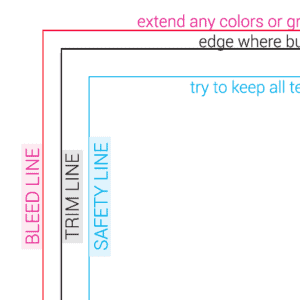
A: In general, bleed simply refers to any color, lines, or other graphics that extend past the trim line. In printing, when we say the art files need to have bleed, what we’re really saying is that the art needs to extend an extra 1/8” past the trim line. Bleed, in this context, is referring to that extra 1/8″.

Q: When does my file need to include bleeds?

A: When you have a design with any elements intended to “bleed off” the edge of the paper, you need to extend those elements an extra 1/8″ past the edge. The mistake is in designing the art to run right up to the edge, but not including that extra 1/8”.

Note: In the images below, the cyan border indicates the trim line. The magenta border indicates the bleed line.

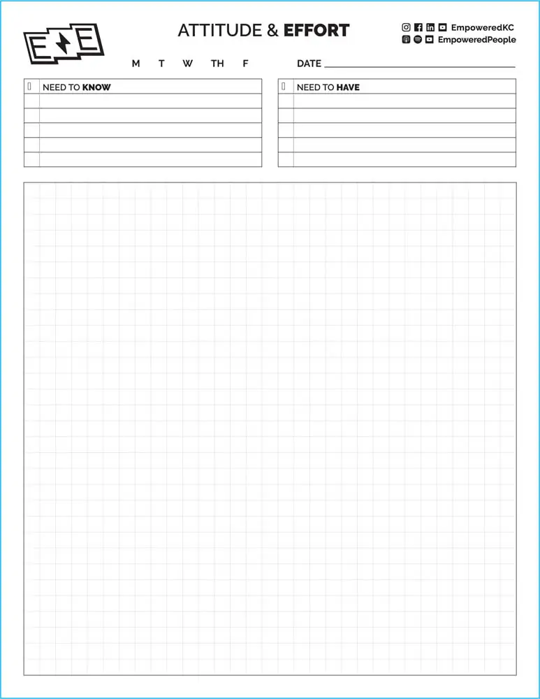
This artwork does NOT bleed, and the file size should be the same as the trim size (8.5 x 11).
This artwork DOES bleed, and the green/gray bar and stroke should extend 1/8″ past the blue border (8.75 x 11.25).

Q: Why do I need to set up bleeds in my artwork?

A: If the item bleeds, it has to be trimmed. While this is done on a machine that’s very precise, there’s still the potential to be slightly off. Without bleed, the person trimming your business cards or brochure would have to trim exactly on the edge of the art – a hair off and you’d have a white line instead of color or graphic all the way to the edge.

See the objects flyer sample. I highlighted the 1/8″ bleed in magenta. Imagine if that pink background were actually printed. You can see how there would be a good chance of seeing a pink hairline on the edges of the flyer after trimming the incorrect file.

WRONG: pattern stops at trim line.
RIGHT: pattern extends to bleed line.

ok, so bleeds are important. how do i set them up?

Q: What size should my bleeds be?

A: For most print projects, the bleed should be 1/8″ (.125). There are exceptions; for large items like posters or signage, printers want more bleed, generally 1/2″ (.5).

Occasionally, printers don’t need bleed for larger items, but these cases are the exception, not the rule. And supposing no bleeds are needed, it’s easy to crop your artwork to size, but the reverse… not so much. It’s always better to build bleeds in at the beginning of the design process. Make sure when you set up your document size, you’re also setting up the bleed settings and extending your artwork.

Q: How do I set up bleeds in my art files?

A: The correct way to set up bleeds is in the page/document settings. Your software will add a magenta border outside the trim line so you know the minimum distance to extend your background color or pattern.

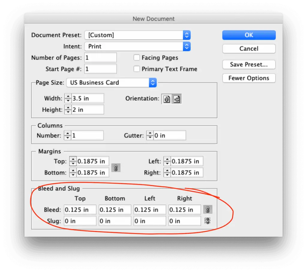
In InDesign, when you create a New Document, there will be bleed settings at the very bottom (you may have to click “More Options”). Set this to 1/8″ (.125″) on all sides. For an existing document, go to File > Document Setup > then add the .125″.

In Illustrator bleeds are also in the New Document window, or under File > Document Setup for existing documents.

It’s telling that Photoshop does not have bleed options; it should never be used for print layouts. However, if you find yourself having to export a PSD file for printing, simply make the document size 1/4″ larger than necessary and make sure the art extends to the edge. For example: if your project is intended to be 5″ x 7″ finished size, make your document size 5.25″ x 7.25″.

Q: How do I export my files for printing?

A: As a PDF with specified bleed settings. This is an important step; if you set up the file properly but forget this part your file will lack proper bleeds.

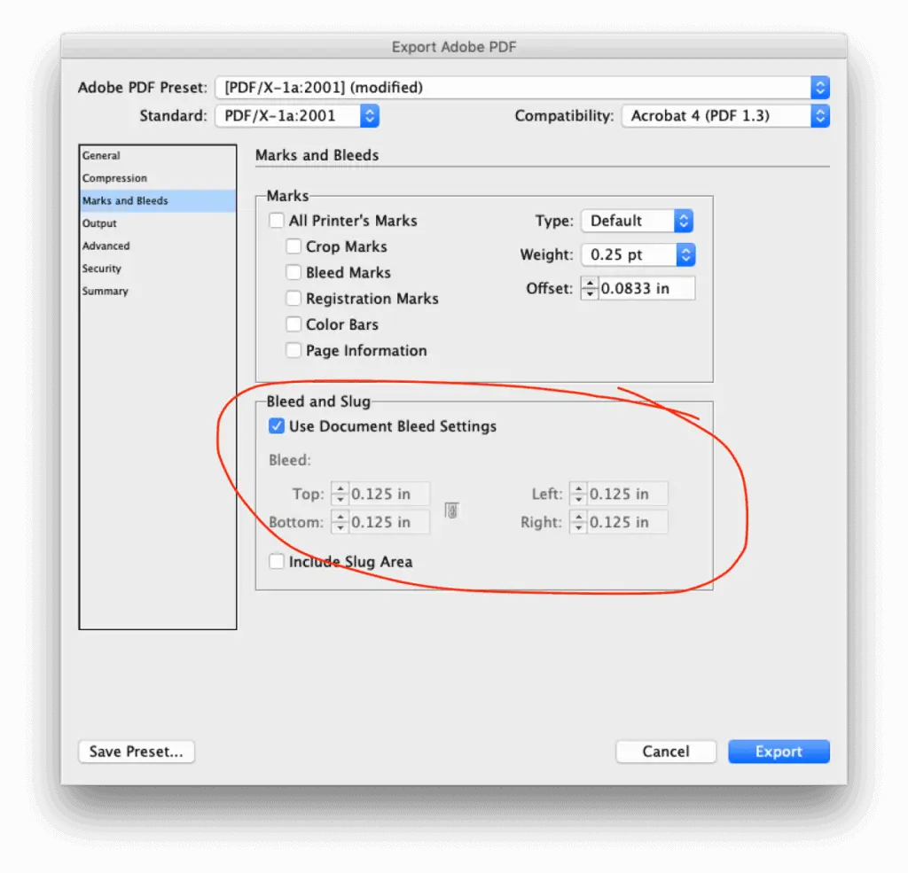
In InDesign, go to File > Adobe PDF Presets. Choose High Quality Print, or PDF/X-1a:2001 if your artwork has transparency. After you hit Save, you’ll see an Export Adobe PDF dialog box. Select the Marks and Bleeds tab on the left, then click “Use Document Bleed Setting.” If you set those up properly, it should change from 0 to .125″. Crop marks are optional and depend on the printer (they can still work with the file if you leave them off).

In Illustrator the process is the same, except that you will choose File > Save As > PDF, then change the Adobe PDF preset in the dropdown at the top.

Again, Photoshop should not be used for print files, but if you must, you generally should be saving as a TIF file. The process won’t be any different as long as you’ve made the document .25″ larger (5 x 7 becomes 5.25 x 7.25).

quick video of how to set up a new doc and export with bleeds

Hopefully this post has answered all your questions, and you now understand why bleeds matter and how to use them. If you’d rather not worry about it, contact us about designing your print files so you’ll know they’re ready for production.

Most of our clients just send us what they’re thinking and we create a design, or send in new names and info when they have new employees who need cards. But the bleed question does come up from time to time, so I figured it was time to address it in a blog post as a service to any designers trying to get files ready to print.

If you have any questions, please comment below. You can also make suggestions for topics you’d like us to cover. Education is a huge part of what we do at cyclone press, so if you have a nagging question about design, printing, website development or why your Mac does that weird thing it does, let us know.

I recently received an email from a new freelance designer about a project that hadn’t gone well. If you’ve been working in design for any length of time it’s a familiar story, unfortunately.

Client is a friend. Pricing is set within a certain range. Work begins, but the business partner has different ideas. It takes hours of work to make both people happy. When the project is complete, the partner refuses to pay the (reasonable) billed amount. Why? Because it’s a measly bit higher than a mass logo design website.

The designer asked how to avoid this in the future, and I typed out a massive email. Because these problems are so common I’m posting an edited version here in hopes it will help other designers.

If you’re a small business owner or project manager who works with designers, I’ve got tips for you too. To jump to that section, click here.


working as a designer?

1) Require a down payment.

Every time. Don’t touch a thing until the client has given you 50% down on the project. If they’re serious, they’ll pay a deposit. If they aren’t serious, you’ll find out quick without wasted time. I know this feels like a pain, but do it anyway, for everyone.

2) Use an invoicing system.

Pricing should be in writing, but it’s more professional (and easier to reference) if it’s not in the body of an email. If you’re testing the freelance waters, you can use Harvest for free for 2 projects a month (I thought FreshBooks had a free version, but it appears it’s now only a free trial). I was also just informed Wave Apps is free and it seems pretty slick. A discussion of the best invoicing options is beyond the scope of this article, so pick something and use it. Just use something (and I don’t mean InDesign).

3) Get more information up front.

For logo design, you need to know details about your client’s business, like target market, color preferences, et cetera. At minimum, ask for examples of logos they like so you can get a feel for the design style they’re trying to achieve. Sometimes those examples will be all over the place, and sometimes people have no idea what they want. This won’t magically solve a fuzzy design brief (clients, see point #1 below) but it will prevent some obvious miscommunication.

4) Track your time and notify.

I don’t feel like I should have to say this, but use a time tracker. Many invoicing systems will include one. Otherwise, use an app. See this post for a brief recap of the tracker I use. If you’re working, have a timer running. Period.

Have an idea of how much time you expect to spend on a design before you start. If time starts creeping up, notify them early you’re running out of hours. Guys, I’ll be honest, if you’re a perfectionist, this never gets any easier. I (still) might spend an extra hour or more tidying up things in a complex piece that no one will ever notice. You have to make that call. Sometimes making sure the margins are perfect to a 10th of an inch is something I choose to do because I’m ridiculous. Just be aware of it.

5) Price hourly to start.

In the beginning, hourly design rates will help you keep track of time. Guesstimate your hours x your rate and there’s your estimate. For example: 2-3 hours x 50/hour = $100-150. If they ask for something complex while design is in progress, inform them it will take you another hour (or whatever). Just don’t start doing it without assessing how it’s going to affect your time, and let them make that call.

When you’re first starting out, keep your skill level in mind with your estimates. If the project requires learning a new technique, give yourself some extra time. Learn the technique first, track time only as you apply it, and know there might be an unpaid hour in there to polish it up. That’s just how you learn, and it’s why experienced designers can charge more per hour.

6) Work with the decision maker.

If there’s more than one decision maker involved, ask yourself if you really want to work on this project. If yes, work directly with the decision maker, not the administrative assistant or the janitor or the customer in the waiting room. If the design involves a committee, don’t do it. I mean, you can if you want, but don’t say I didn’t warn you.

7) If there’s a second decision maker who wants to use a design site, or “knows someone”, walk away.

 Nothing you do will ever be as good as the imaginary other guy in the business partner’s head. Trust me on this.


working with a designer?

1) Know what you want (roughly) before you try to work with a designer.

The more clear you are with what you want, the better the final product will be. This is especially true if you have a business partner. Don’t assume you agree on design style until you’ve actually talked about it. The business partners in our story should have decided on their vision for the logo before they ever hired the designer. They may not even have known there was conflict, but if they’d both provided samples it would have become clear quickly. Your designer is not your mediator.

The more experienced the designer you’re working with, the more rough your outline can be. Experienced designers can fill in the gaps by asking the right questions.

2) Do your research.

Don’t choose a designer because they’re in your networking group. Especially when it comes to logo design – take the time to actually look at their portfolio. If they don’t have one, that’s a red flag. If their work sucks, well, don’t hire them. You won’t know if you don’t look.

If you know nothing about logo design or branding for small business, google a few articles so you have a rough idea of what to look for (here’s one). This will help you ask the right questions and identify who knows what they’re doing and who doesn’t. The same goes for website design. I was once asked to quote a redesign on a website I thought had been around for a while. Turns out it was less than a year old, but was built using old software and styling. Don’t let this happen to you.

We’re all about education around here, so I’ll try to write more on these topics, but if you have questions, please ask.

3) Pick a project lead.

Decide who’s got point and filter feedback through them. Bad: both business partners, the secretary and the sales guy all individually emailing the designer changes. Good: those people sending their feedback to a single point of contact within their organization. That person then assesses it, decides if the team needs to discuss, then sends one email to the designer with requested edits that are not in conflict.

If you don’t assign a single point of contact, it’s likely that the designer will end up correcting grammatical changes that were previously “fixed” by other staff members or adding colors that were already vetoed by the partners (the secretary wasn’t in that meeting). Prevent wasted time and energy by choosing a project lead before starting the project. Your designer will thank you for it.

4) Don’t make decisions based on price alone.

In this post we happen to be discussing logo design (although you should be thinking brand design, which involves much more). Your logo is the mark that will be on your website, every marketing piece and business card printed. A logo is like a tattoo for your business. There’s never a good reason to get a cheap tattoo. If you’re committed to your small business, do it right the first time. Professional presentation can make the difference between whether or not someone chooses to work with you.

So on that note, please don’t use bargain bin logo design websites. No designer worth their salt has an ounce of respect for these sites. They’re notorious for ripping off, even impersonating, other designers. Do you really want to take that risk? I’m not saying every designer who works through a crowd-sourced site is a hack or a thief, but it’s a good way to find the ones who are.

In small business and entrepreneurship, it’s all about building relationships and trust. Word of mouth referrals are everything. Ask around and see who knows someone locally.

I believe it’s best to work consistently with the same providers. I’ve structured my entire business around being your consultant and point of contact for all things design, print and web. Even if I refer out for something we don’t do (SEO, video) I will help you navigate those providers, then work with them directly. When you work with cyclone press, we know you, we know your business, we know your branding. We’re right here in Kansas City and we’re only a phone call away.

Item added to cart.
0 items - $0.00